Chapter 4 Customizing Pivot Tables
Pivot tables are powerful tools for data analysis and visualization in Excel. They provide a dynamic and flexible way to summarize and explore large datasets. However, to truly harness the potential of pivot tables, it is essential to understand how to customize them. This section will guide you through the process of customizing pivot tables, covering various aspects such as changing field settings, grouping data, sorting and filtering, and formatting pivot tables. By mastering these customization techniques, you can tailor pivot tables to meet your specific analysis and presentation needs.
4.1 Changing Field Settings
Changing field settings allows you to control how the data is summarized and displayed within the pivot table. Excel offers various options to modify field settings for row fields, column fields, and value fields.
4.1.1 Accessing Field Settings
To change field settings in a pivot table, you need to access the PivotTable Field List. This can be done by clicking anywhere inside the pivot table, which activates the PivotTable Tools in the Excel ribbon. From the Analyze or Options tab, click on the “Field List” button to display the PivotTable Field List pane. The field list contains all the available fields from your data source that can be added to the pivot table.
4.1.2 Modifying Value Field Settings
Value fields in a pivot table contain the data that is summarized and displayed within the table. Excel provides several options to modify the settings of value fields:
Summarization Function: By default, Excel applies the “Sum” function to numeric value fields. However, you can change the summarization function to suit your analysis needs. Right-click on a value field in the pivot table, select “Value Field Settings,” and choose a different function such as count, average, minimum, maximum, or a custom calculation.
Number Format: You can also modify the number format of the values displayed in the pivot table. Right-click on a value field, select “Value Field Settings,” and click on the “Number Format” button. From here, you can choose the desired format, such as currency, percentage, scientific notation, or custom formats.
Custom Calculations: In addition to the built-in summarization functions, Excel allows you to create custom calculations based on the existing value fields. This can be done by adding a calculated field to the pivot table. From the PivotTable Field List, click on the “Fields, Items & Sets” button and select “Calculated Field.” Here, you can define a formula using operators, functions, and references to other value fields.Here are some key customization options:
Subtotals and Grand Totals: Excel allows you to control the display of subtotals and grand totals. You can choose to show or hide subtotals at different levels and include or exclude grand totals in the pivot table.
4.1.3 Field Settings Best Practices
To make the most of field settings in a pivot table, consider the following best practices:
Understand Your Analysis Needs: Before modifying field settings, have a clear understanding of the analysis objectives and the insights you want to derive from the data. This will help you make informed decisions about the summarization functions, number formats, and custom calculations.
Test and Iterate: It is often beneficial to experiment with different field settings to find the most suitable configuration for your analysis. Don’t hesitate to try different summarization functions, grouping options, or formatting styles until you achieve the desired results.
Document and Share: Once you have customized the field settings in a pivot table, consider documenting the changes or saving them as a template for future use. This will allow you to replicate the analysis or share it with others while maintaining consistency.
4.2 Grouping Data
Grouping data within pivot tables provides a way to organize and categorize information. Excel offers grouping options for both row fields and column fields. Here are the main grouping techniques:
Date and Time Grouping: You can group date and time fields into predefined intervals such as days, months, quarters, or years. This simplifies the analysis of time-series data and enables you to identify patterns and trends more easily.
Numeric Grouping: For numeric fields, you can create custom groups or intervals to group values based on specific criteria. This allows for a more structured analysis, particularly when dealing with continuous data.
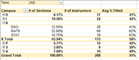
Hierarchical Grouping: Excel allows you to create hierarchical groups by nesting one field within another. For example, you can group products by category and then by subcategory. This hierarchical grouping provides a more detailed and organized view of the data.
4.2.1 Understanding Grouping Data in a Pivot Table
Grouping data in a pivot table involves combining individual values into categories or hierarchies based on specific criteria. It allows you to organize and present data in a more meaningful and structured manner. Grouping can be applied to both row fields and column fields, enabling you to create a hierarchical view of the data.
4.2.2 Grouping Date and Time Data
One common scenario for grouping data in a pivot table is working with date and time fields. Excel provides various grouping options for date and time data, including:
Grouping by Days, Months, Quarters, or Years: You can group date fields into meaningful intervals such as days, months, quarters, or years. This allows for a higher-level analysis of trends and patterns over time.
Custom Date Grouping: Excel also allows you to define custom groupings for date fields. For example, you can group dates by specific periods, like fiscal weeks or marketing campaign durations. This level of customization provides more flexibility in analyzing data based on specific business needs.
Grouping Time Data: Similar to date grouping, you can group time fields into intervals such as hours, minutes, or seconds. This is useful when working with datasets that require more granular analysis based on time intervals.
4.2.3 Grouping Numeric Data
Grouping numeric data in a pivot table provides a way to create intervals or categories based on specific criteria. Some use cases for grouping numeric data include:
Creating Age Ranges: When working with age data, you can group the values into ranges (e.g., 0-10, 11-20, etc.) to gain a better understanding of age distribution within the dataset.
Categorizing Numeric Values: Grouping numeric values allows you to create categories that make analysis easier. For instance, you can group sales figures into ranges to analyze sales performance based on different revenue segments.
Custom Numeric Grouping: Excel provides the flexibility to define custom numeric groupings based on specific requirements. This allows you to tailor the groupings to match your analysis needs and create more meaningful insights.
4.2.4 Grouping Text Data
Grouping text data in a pivot table is useful for categorizing or organizing information based on specific text values. Some scenarios where grouping text data is beneficial include:
Categorizing Product Names: Grouping product names into specific categories helps in analyzing sales performance by product category. This grouping can be done based on common attributes or predefined categories.
Organizing Geographic Data: If your dataset includes geographic information, you can group locations by regions, countries, or other geographical divisions. This provides a higher-level overview of the data and simplifies analysis by geographic regions.
Grouping Other Textual Attributes: Grouping text data allows you to create logical categories for other attributes such as departments, customer segments, or job roles. This provides a more structured view of the data and helps in analyzing specific subsets of information.
4.2.5 Creating Hierarchies
Grouping data in a pivot table also allows you to create hierarchies, enabling a more detailed analysis. Hierarchies provide a structured and nested view of the data, allowing you to drill down into different levels of granularity. Some common hierarchies include:
Date and Time Hierarchies: You can create date hierarchies by grouping fields at different levels, such as year, quarter, month, and day. This allows you to analyze data at various levels of time granularity.
Product Hierarchies: In sales or inventory datasets, you can create product hierarchies by grouping fields such as category, subcategory, and product name. This enables you to analyze sales performance at different levels of product categorization.
Geographic Hierarchies: Hierarchies can be created for geographic data by grouping fields such as region, country, and city. This allows you to drill down into specific geographic areas and analyze data accordingly.
4.2.6 Applying Multiple Groupings
Excel pivot tables allow you to apply multiple groupings simultaneously, providing a more comprehensive analysis. You can group data by multiple fields within the same row or column area. This allows for a multidimensional view of the data, enabling you to analyze different combinations of categories and hierarchies.
4.2.7 Dynamic Grouping
Dynamic grouping in a pivot table allows you to change the grouping options and update the pivot table dynamically. This is particularly useful when working with large datasets that require frequent adjustments to the grouping structure. With dynamic grouping, you can explore different perspectives of the data without recreating the entire pivot table.
4.2.8 Benefits of Grouping Data in a Pivot Table
Grouping data in a pivot table offers several benefits for data analysis:
Enhanced Data Organization: Grouping data provides a logical and organized structure that improves the visual representation of the data. This allows for better understanding and interpretation of the information.
Simplified Analysis: Grouping allows you to condense large amounts of data into meaningful categories or hierarchies. This simplifies the analysis process and helps in identifying patterns, trends, and outliers more efficiently.
Improved Data Exploration: Grouping provides the flexibility to drill down into specific subsets of data within the pivot table. This enables a more granular analysis and the ability to explore the data from different angles.
Streamlined Reporting: Grouping data in a pivot table allows you to create concise and informative reports. By presenting data in a structured and categorized format, you can communicate insights effectively and support data-driven decision-making.
4.3 Sorting and Filtering
Sorting and filtering options in pivot tables allow you to organize and manipulate the data to focus on specific subsets. Here’s how you can sort and filter pivot tables:
4.3.1 Sorting Data in a Pivot Table
Sorting data in a pivot table allows you to arrange information in a particular order based on selected criteria. Excel provides several sorting options for both row fields and column fields:
Ascending and Descending Order: You can sort data in ascending (A to Z) or descending (Z to A) order. This is particularly useful when you want to identify the highest or lowest values within a field.
Value Sorting: Excel allows you to sort data based on the values within a field. You can sort by sum, average, count, minimum, maximum, or other applicable calculations. This sorting option helps in analyzing data based on specific aggregated values.
Manual Sorting: Manual sorting enables you to arrange data in a custom order. By clicking and dragging field items within the pivot table, you can rearrange them to meet your analysis requirements.
4.3.2 Filtering Data in a Pivot Table
Filtering data in a pivot table allows you to focus on specific subsets of information, enabling a more targeted analysis. Excel offers several filtering options for row fields, column fields, value fields, and report filters:
Label Filters: Label filters allow you to filter data based on the values of a specific field. You can include or exclude specific values, filter by specific text, or apply conditions such as “begins with,” “ends with,” or “contains.”
Value Filters: Value filters enable you to filter data based on specific criteria or conditions. You can filter data that meets certain numerical conditions, such as greater than, less than, between, or equal to a particular value.
Top/Bottom Filters: Top/bottom filters allow you to focus on a specified number or percentage of top or bottom values within a field. This is useful when you want to analyze the highest or lowest values within a dataset.
Multiple Filters: Excel pivot tables allow you to apply multiple filters simultaneously. By combining different filters using AND or OR operators, you can create complex filter criteria to refine your analysis.
4.4 Custom Filters in a Pivot Table
In addition to the standard filtering options, Excel provides custom filtering capabilities within a pivot table. Custom filters allow you to define specific filtering conditions based on your analysis requirements:
Custom Text Filters: Custom text filters enable you to create custom filtering conditions using text criteria. This allows for more advanced text-based filtering, such as filtering data that contains specific words or phrases.
Custom Date Filters: Custom date filters allow you to define custom filtering conditions for date and time fields. You can filter data based on specific date ranges, periods, or relative dates.
Custom Number Filters: Custom number filters provide the flexibility to create custom filtering conditions based on numerical criteria. You can filter data based on specific ranges, greater than or less than values, or advanced calculations.
4.4.1 Sorting and Filtering Best Practices
To make the most of sorting and filtering in a pivot table, consider the following best practices:
Understand Your Analysis Objectives: Before sorting and filtering data, have a clear understanding of your analysis objectives. Determine the specific insights you want to derive from the data, and identify the relevant sorting and filtering criteria.
Refresh and Update Data: It is essential to refresh and update the pivot table data regularly, especially when working with dynamic datasets. This ensures that the sorting and filtering reflect the latest information.
Utilize Multiple Sorting and Filtering Criteria: Instead of relying on a single sorting or filtering criterion, consider using multiple criteria to gain deeper insights. Combining different criteria allows you to focus on specific subsets of data and explore various aspects of your information.
Document Your Sorting and Filtering Choices: It is helpful to document the sorting and filtering choices you make in your pivot table. This allows you to replicate your analysis, track your decision-making process, and share your findings with others.
4.4.2 Sorting and Filtering Report Filters
Report filters are another powerful feature in pivot tables that allow you to filter data across the entire table. Sorting and filtering options for report filters work similarly to row and column fields, enabling you to narrow down the data displayed in the pivot table based on specific criteria.
Sorting Report Filters: You can sort report filters alphabetically or numerically to arrange the filter values in a desired order. This makes it easier to locate specific values and navigate through the filter options.
Filtering Report Filters: Filtering report filters allows you to include or exclude specific values or apply custom filtering conditions. This helps in focusing the analysis on subsets of data that are relevant to your analysis objectives.
4.4.3 Clearing Sorting and Filtering
Excel provides options to clear sorting and filtering in a pivot table when you want to revert to the original state:
Clear Sorting: To remove sorting from a field in a pivot table, you can click on the sort icon next to the field and select “Clear Sort.”
Clear Filtering: To remove filtering from a field in a pivot table, you can click on the filter icon next to the field and select “Clear Filter.”
4.4.4 Formatting Pivot Tables
Formatting is a crucial aspect of pivot table customization as it helps improve the visual appeal, readability, and overall presentation of the data. With Excel’s extensive formatting options, you can enhance the appearance of your pivot tables and highlight key insights. In this section, we will explore the importance of formatting in a pivot table, discuss various formatting techniques, and provide practical tips for effective formatting.
4.4.5 Applying Pivot Table Styles
Pivot table styles are predefined formatting sets in Excel that provide a consistent and visually appealing look to the pivot table. Excel offers a variety of built-in styles that you can apply with a single click. Here are some key aspects of applying pivot table styles:
Selecting a Style: To apply a pivot table style, select any cell within the pivot table, navigate to the PivotTable Tools Design tab in the Excel ribbon, and choose a style from the available options. Excel provides various styles with different color schemes, font styles, and border designs.
Modifying Style Elements: Pivot table styles are highly customizable. You can modify individual elements of a style, such as fonts, colors, shading, and borders. This allows you to tailor the style to match your specific preferences or branding requirements.
Creating Custom Styles: Excel also allows you to create custom pivot table styles by modifying existing styles or creating new ones from scratch. This feature provides flexibility in designing unique styles that suit your specific needs.
4.4.6 Cell Formatting in a Pivot Table
Cell formatting enables you to modify the appearance of individual cells within a pivot table. This helps in highlighting specific values, emphasizing key insights, or improving data readability. Here are some common cell formatting options:
Font Formatting: Excel provides various font formatting options, including font type, size, color, and style (bold, italic, underline). You can modify the font formatting for specific cells or ranges within the pivot table to draw attention to important information.
Alignment and Indentation: Excel allows you to adjust the alignment and indentation of text within cells. You can align text to the left, center, or right of a cell and apply indentation for a more organized and structured presentation of data.
Number Formatting: Number formatting helps in displaying numeric values in a desired format, such as currency, percentage, decimal places, or scientific notation. By applying number formatting, you can improve the readability and interpretation of numeric data within the pivot table.
Conditional Formatting: Conditional formatting allows you to apply formatting rules based on specific conditions or criteria. This helps in visually highlighting patterns, trends, or outliers in the data. You can define custom rules or choose from a variety of predefined formatting options like color scales, data bars, icon sets, and more.
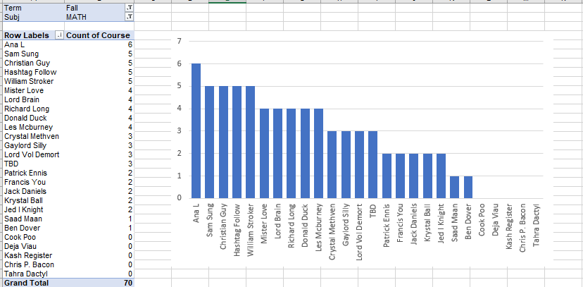
4.4.7 Charting from a Pivot Table
Charting is a powerful visualization tool that enables you to present data in a graphical format. Excel allows you to create various types of charts directly from a pivot table. Here’s how you can chart from a pivot table:
Selecting Data: Click on any cell within the pivot table, navigate to the PivotTable Tools Analyze or Options tab, and click on the “PivotChart” button. Excel will automatically select the pivot table data for chart creation.
Choosing a Chart Type: Excel offers a wide range of chart types, including column charts, bar charts, line charts, pie charts, and more. Select the chart type that best represents your data and analysis requirements.
Modifying Chart Elements: Once the chart is created, you can customize various chart elements such as titles, legends, axes, gridlines, data labels, and colors. Excel provides a set of formatting options that allow you to fine-tune the appearance of the chart to match your preferences.
Interacting with the Chart: Pivot charts are dynamic and interactive. You can drill down into the underlying data by clicking on chart elements, change chart views, and filter the data directly from the chart. This provides a more engaging and exploratory experience while analyzing the data.
4.4.8 Formatting Row and Column Headers
Row and column headers in a pivot table provide important contextual information about the data. Formatting these headers enhances the visual clarity and organization of the pivot table. Here are some formatting options for row and column headers:
Font and Font Formatting: You can modify the font type, size, color, and style (bold, italic, underline) of the row and column headers. This allows you to emphasize the headers and improve their readability within the pivot table.
Background Color: Excel enables you to apply background colors or shading to the row and column headers. This helps in visually differentiating the headers from the data cells and improves the overall appearance of the pivot table.
Borders and Gridlines: Applying borders and gridlines to the row and column headers adds structure and delineation to the pivot table. Excel provides various border styles and thickness options that allow you to customize the appearance of the headers.