Chapter 2 Getting Started with Excel Graphs
Microsoft Excel is a powerful and widely used spreadsheet software that offers a range of data analysis and visualization tools. Among its many features, Excel’s graphing capabilities stand out as a crucial tool for presenting data in a visually appealing and insightful manner. In this chapter, we will explore how to get started with Excel graphs, from setting up data for graphing to creating a simple graph from scratch.
2.1 Introduction to Microsoft Excel and Graphing
Microsoft Excel, part of the Microsoft Office suite, is a versatile application used for data entry, analysis, and visualization. It provides a user-friendly interface that allows individuals with varying levels of expertise to work with data effectively. Excel’s graphing tools enable users to transform raw data into various chart types, making it easier to interpret and understand trends, patterns, and relationships.
Graphs, also known as charts, are visual representations of data. They serve as powerful tools to communicate insights and findings from data analysis. Excel offers a wide array of chart types, including line charts, bar charts, pie charts, scatter plots, and more. Each chart type is suitable for different types of data and analysis goals.
2.2 Setting up Data for Graphing
Before creating graphs in Excel, it is essential to ensure that your data is properly organized and formatted. Follow these steps to set up data for graphing:
2.2.1 Data Organization
Ensure that your data is organized in a logical manner. Typically, data is organized into columns and rows. Each row represents a unique data point, and each column represents a variable or category. The first row may contain headers that describe the data in each column.
For example, let’s consider a dataset containing sales data for different products over several months. The first column might contain the names of the products, the first row may have the months, and the cells within the table would contain sales figures.
| Product | January | February | March | |
|---|---|---|---|---|
| Product A | 100 | 150 | 200 | … |
| Product B | 80 | 90 | 110 | … |
| Product C | 50 | 70 | 90 | … |
| … | … | … | … | … |
2.2.2 Data Formatting
Ensure that the data is formatted correctly. Numeric data should be in numerical format, dates should be recognized as dates, and text should be in the appropriate format. Incorrect data formats can lead to inaccurate graphs.
To format data in Excel, follow these steps:
- Select the cells containing the data you want to format.
- Right-click on the selected cells and choose “Format Cells.”
- In the Format Cells dialog box, choose the appropriate category (e.g., Number, Date) and customize the formatting options as needed.
- Click “OK” to apply the formatting to the selected data.
2.3 Creating a Simple Graph in Excel
Now that our data is organized and formatted, let’s create a simple graph in Excel. For this example, we will create a line chart to visualize the sales data for Product A over the months.

2.3.1 Selecting Data for the Graph
To create a graph, first, select the data you want to include in the chart. In our example, select the cells containing the months and the corresponding sales data for Product A. The data should form a logical range, such as a row or a column.
2.3.2 Inserting the Graph
Once the data is selected, follow these steps to insert the graph:
- Click on the “Insert” tab in the Excel ribbon at the top of the screen.
- In the Charts group, choose the “Line Chart” option (you can select other chart types if you prefer).
- From the drop-down menu, select the specific line chart style you want to use. For this example, choose a basic line chart.
2.3.3 Customizing the Graph
After inserting the chart, Excel will display it in the worksheet. Now, it’s time to customize the graph to make it more informative and visually appealing. Here are some ways to do that:
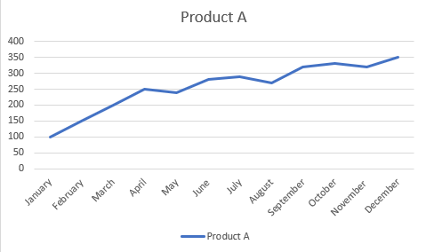
Chart Title: Click on the chart title (usually labeled “Chart Title”) and enter a descriptive title, such as “Product A Sales over Time.”
Axis Labels: Click on the horizontal (x-axis) and vertical (y-axis) labels to edit and provide clear descriptions of the data displayed.
Legend: If Excel didn’t automatically add a legend, you can include one by clicking on “Legend” in the Chart Elements menu.
Data Labels: To display the actual data points on the graph, click on “Data Labels” in the Chart Elements menu.
Formatting: Customize the chart’s appearance, such as colors, fonts, line styles, and background, to match your preferences or corporate branding.
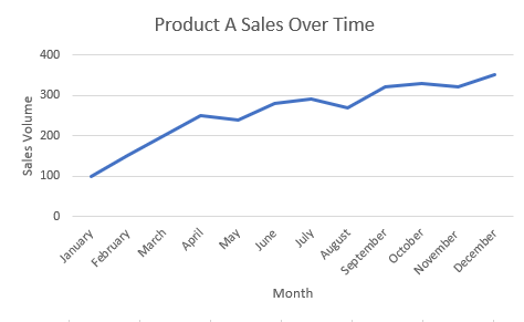
2.3.4 Interpreting the Graph
Once you have customized the graph, take a moment to interpret the insights it provides. In our example, the line chart for Product A sales over time shows whether sales have increased or decreased each month. The line’s trend indicates the overall sales trend for Product A, and individual data points show the sales figures for specific months.
2.3.5 Updating the Graph with New Data
One of the advantages of using Excel graphs is their flexibility in handling updated data. If your dataset changes, simply adjust the data range by dragging the handles of the chart or by clicking on “Select Data” in the Chart Elements menu. Excel will automatically update the graph with the new data, saving you time and effort.
2.4 Conclusion
Congratulations! You have successfully taken your first steps into the world of Excel graphs. In this chapter, we introduced Microsoft Excel and its graphing capabilities, explored data setup and formatting, and created a simple line chart from scratch. Excel’s graphing tools provide a powerful way to visually communicate data insights, making complex information accessible and easy to understand. As you progress through this book, you will explore more chart types, advanced graphing techniques, and best practices to create visually compelling and impactful graphs. Let’s continue our journey to Excel Graphs Mastery!