Chapter 5 Types of Graphs
Understanding what type of graph to use is incredibly important when you are designing a visualization. In this chapter, we will go over some of the basic chart types and what the best practices are for each.
5.1 Simple Text
When you are trying to communicate a number or two, consider just stating the number. Make it prominent with few words to help it. When using a table or chart in instances with few numbers, the message tends to fall flat.
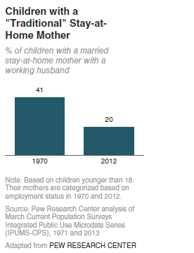
Example: Consider the following data. The data came from a report from Pew Research Center. The idea was that few children had stay-at-home moms in 2012.
Image Credits - Cole Knaflic (Knaflic (2015)) In this example, we have too much text. There is lots of wasted space and only really two numbers. In addition, if the message is that 20% is small, that does not come across as the right bar seems to be almost half of the height of the chart. (Of course, we know that 20% is less than half of 41% and that 41% is less than 50% to begin with, but is this the best way to drive your point home?)
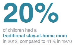
A better way is below.
Image Credits - Cole Knaflic (Knaflic (2015)) Another note, avoid a graphic that says that there are fewer than 50% of stay-at-home mothers in 2012 compared to 1970 as without the reference to the 41%, some of the context is lost.
5.2 Tables
Avoid using tables in presentations. As the audience attempts to read the table, the focus switches from you to the table. In reports, however, tables are often the way to go. When reading reports, the audience has much more time to digest the message and they can do so at their own pace without worrying about the typed message being lost.
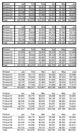
Borders should be used only when their inclusion adds to the legibility of your table. If you must have them, consider grey borders. A border separating the column labels from the data is allowed. However, try to use white space to separate rows and columns where possible.
 |
|---|
| Image Credits - Stephen Few (Few (2012)) |
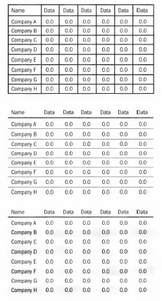
Example: The first table below is a standard “Microsoft Excel” looking table. Consider how we might clean it up.
Image Credits - Donna Wong (Wong (2010))
When arranging data, consider what your columns and row labels should be. Consider using groupings and repeat column/ row headers at the beginning of each group. This keeps the structure consistent from group to group.
When formatting text, all text should be oriented horizontally and in a sensible left to right order. Never order your data at random (alphabetically is very close to random in many cases). Align numbers to the right and ensure that the same number of decimal places are kept for each number. Non-numerical values should be left aligned (with the possible exception of centering non-numeric items with the same number of characters). Select a font that is legible and maintain the same font throughout. Using bold typeface or colour is useful if you want to highlight groups.
Make columns containing group summaries visually distinct from the detail columns. Consider putting summaries at the top of a group rather than at the bottom.
Including a chart in a table if space is available. It often increases the message.
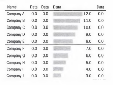
Example: This example has a bar graph with the numerical data included. The eye is immediately drawn to the graph. Including the graph will highlight the important parts of the data.
Image Credits - Donna Wong (Wong (2010))
5.3 Heatmap
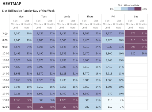
A heatmap is a way to enhance a table. Rather than having to scan the table to find high and low values, the colour saturation helps us target key numbers quickly.
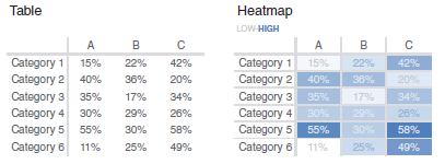 |
|---|
| Image Credits - Cole Knaflic (Knaflic (2015)) |
Example: Heatmaps can be useful for time series tables. Here we use a heatmap to highlight utilization rates.
Image Credits - Lindsay Betzendahl (Rowell, Betzendahl, and Brown (2020))
5.4 Scatterplot
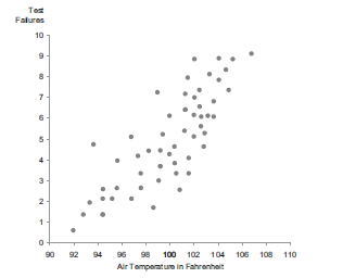
A scatterplot can be useful to show the relationship between two values (one on the x-axis and one on the y-axis). The area of the data should be roughly 2/3 of the range of the y-axis. Using points does not require us to begin at a baseline. Using bars, we need to begin at a baseline. That said, there is nothing stopping you from beginning from a baseline if it adds to the message.
 |
|---|
| Image Credits - Stephen Few (Few (2012)) |
Increments on the y-axis should be meaningful. Increments of 3 or 4 are typically bad compared to increments of 2, 5, 10 or 25.
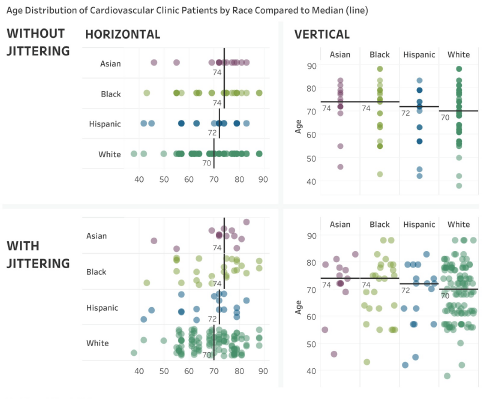
If there are many data points at the same spot on the graph, consider jittering them so that the number of points is clearer.
 |
|---|
| Image Credits - Lindsay Betzendahl (Rowell, Betzendahl, and Brown (2020)) |
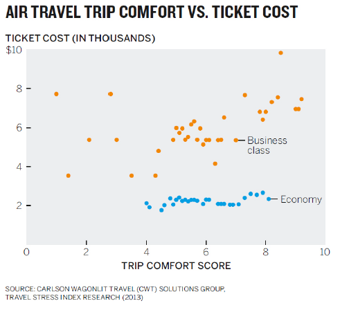
Finally, if you are plotting multiple categories of data, consider not using a legend but rather labeling the data.
 |
|---|
| Image Credits - Scott Berinato (Berinato (2016)) |
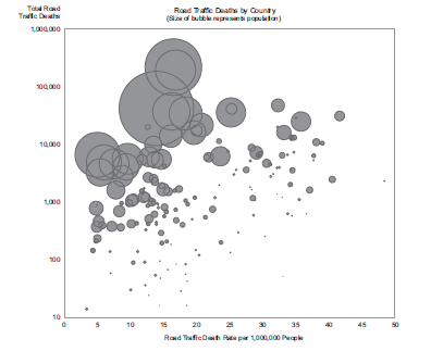
Changing the size of the points can add another layer to the data. Typically, we call these types of graphs bubble plots.
 |
|---|
| Image Credits - Stephen Few (Few (2012)) |
5.5 Line Graph
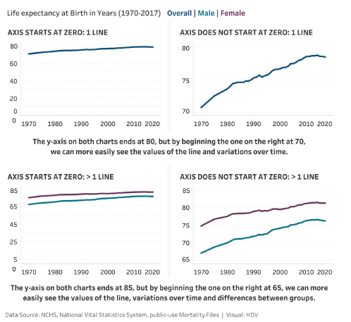
A line graph is used to display a trend over time. Unlike bar graphs, a line graph does not need to begin at a baseline. However, beginning the y-axis a few units before the data begins tends to give a nice visual appeal. As always, ensure that your axis increments at the same rate.
 |
|---|
| Image Credits - Lindsay Betzendahl (Rowell, Betzendahl, and Brown (2020)) |
Avoid using lines that are too thick (it hides the detail) or that are too thin (they are hard to read). As with graphing points, use sensible axis increments and attempt to have your data take roughly 2/3 of the graph range, if possible. The number of lines on a line graph should not exceed four. Avoid the temptation of using dashes or dots to differentiate between the line types. Rather, select colours for each line. If you absolutely need to display more than four categories of data, consider a panel of charts. This avoids the graph looking like spaghetti.
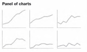 |
|---|
| Image Credits - Donna Wong (Wong (2010)) |
Avoid legends, where possible. If you label the lines directly, the graph becomes clearer and requires less work by the audience to read.
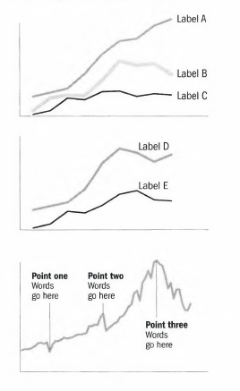 |
|---|
| Image Credits - Donna Wong (Wong (2010)) |
5.6 Slopegraph
Slopegraphs are very useful in special cases. One case is if we want to see change from one time period to another. A second use is to see change from one category to another especially when the categories have different units.
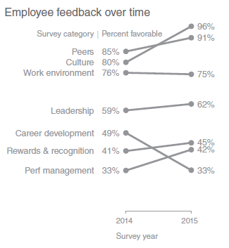 |
|---|
| Image Credits - Cole Knaflic (Knaflic (2015)) |
If many of the data are overlapping, slopegraphs may not work well. Of course, if we want to draw attention to one or more individual slopes, we can shade them differently than the rest.
5.7 Vertical and Horizontal Bar Graph
While many people shy away from bar charts because they are seen as common, in reality they should be used more often because they are so common. Since everyone knows what they are, it takes substantially less effort for people to interpret them leaving them time to hear your message.
The term “bar chart” is fairly generic and should be interpreted as bars (horizontal) as well as columns (vertical).
Visually, bar charts are easy for our eyes to interpret. We interpret them based on height. However, for this reason, it is important to begin bar charts at a baseline as otherwise we get a false comparison of the height. There is never a reason not to begin at a zero baseline.
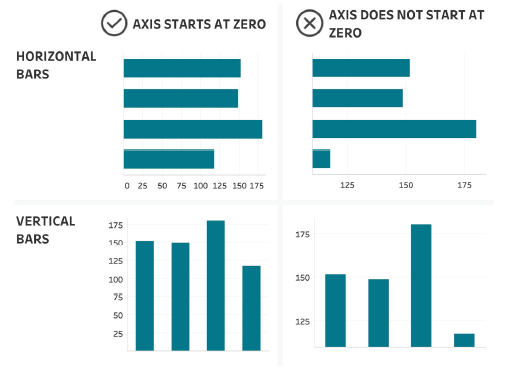 |
|---|
| Image Credits - Lindsay Betzendahl (Rowell, Betzendahl, and Brown (2020)) |
Make sure the bars are not too narrow or too thick. A good rule of thumb is to have the distance between the bars be half of the width of the bars themselves. You should avoid distracting shades and colours for the bars. It is often good practice to put projections in a different shade to emphasize that they are different than the data. Shading and the use of 3D can also interfere with the audience’s ability to determine the height of the bar.
If categories on the horizontal axis are long labels, use horizontal bars rather than slanting your text.
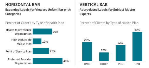 |
|---|
| Image Credits - Lindsay Betzendahl (Rowell, Betzendahl, and Brown (2020)) |
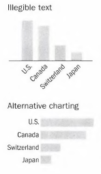 |
|---|
| Image Credits - Donna Wong (Wong (2010)) |
Avoid bar colours that alternate between light and dark. Rather, order the colours from lightest to darkest. Never change the order of the bars. If you have a legend, make sure the order of the legend is the same as the order of the bars.
When selecting the order of the bars, use an order that makes sense. Ranking is normally a good ordering. In order of time is also a good ordering. Conversely, alphabetical is normally not a good ordering.
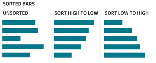 |
|---|
| Image Credits - Lindsay Betzendahl (Rowell, Betzendahl, and Brown (2020)) |
Use direct labeling on your bars to avoid grid lines. However, if you have many bars, a thin line every 4 or 5 bars is acceptable. When graphing negative values, graph them below the x-axis (in the case of vertical bars) or to the left of the vertical axis (in the case of horizontal bars).
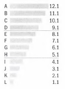 |
|---|
| Image Credits - Donna Wong (Wong (2010)) |
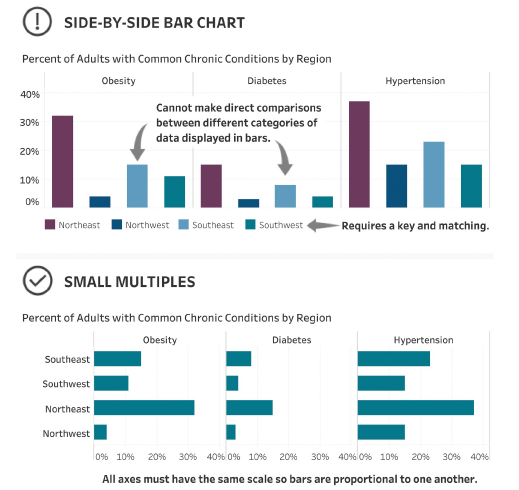
Finally, if you need to compare multiple categories in your visual, avoid putting your charts side-by-side. It is much better to use smaller charts and several of them.
 |
|---|
| Image Credits - Lindsay Betzendahl (Rowell, Betzendahl, and Brown (2020)) |
5.8 Stacked Bar Graph
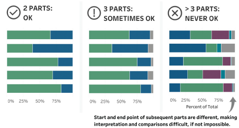
Stacked bar and column charts are saved for special cases. Most of the time, side-by-side or multiple bar charts would be a better option to a stacked chart. There are two rules for stacked bar charts. First, never use more than 3 categories and second, make sure that the data for the first segment of the bar chart is similar in size. Violating either of these rules makes comparisons after the first level very difficult.
 |
|---|
| Image Credits - Lindsay Betzendahl (Rowell, Betzendahl, and Brown (2020)) |
5.9 Waterfall Graph
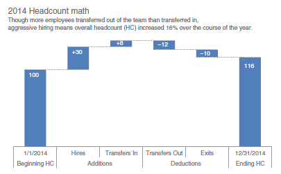
A waterfall chart is similar to a bar graph except it pulls pieces of the stack apart to show increases/ decreases incrementally. In the example below, we show how the headcount of a team evolved over the year 2014. We began with an initial headcount, we added in some new hires and we had some employees transfer in. Those are all represented as positive increases to the headcount. We then had some employees transfer out and some employees exit. Those are shown as negative values on the chart. That leaves us with a final headcount at the end of the year. A waterfall chart is a nice way to show changes when the change comes as a result of both positive and negative changes.
 |
|---|
| Image Credits - Cole Knaflic (Knaflic (2015)) |
Remember, all of the rules that apply to bar/ column charts also apply here.
5.10 Square Area Graph
Most people find deciphering areas very difficult. For that reason, we generally avoid charts that rely on area as the tool of comparison. Pie charts, as you will read below, are among the most difficult to interpret and should be avoided.
The one exception to this rule is the square area chart. If you have to visualize numbers with vastly different areas, you might consider square area charts.
 |
|---|
| Image Credits - Cole Knaflic (Knaflic (2015)) |
Do not mess too much with the icons. Squares work well (best?) because they are divisible in a sensible way. For example, I know what 25% of a square icon looks like, but I might not know what 25% of a car icon looks like since it is asymmetric. (Also, do not cut icons like people, buildings or airplanes in half - it’s disturbing and might elicit a negative reaction from your audience). Furthermore, if you are going to use icons that are different from squares (perhaps your icon is symmetric like a dot or your data is all in whole numbers), do not change the icon within the graphic. It tends to be more distracting than it is helpful. If your icon is going to represent more than 1 unit, make sure you do not use awkward units like 7 or 13. Use multiples of 2, 5, 10, 25, or 100. If you want to draw a distinction between groups, simply change the shade or colour.
 |
|---|
| Image Credits - Donna Wong (Wong (2010)) |
5.11 Avoid These When Possible
To be fair, the reason we are talking about all of the charts below is that someone thought they were a good idea at some point. However, today they are not used very often. In fact, we hope to give you a number of alternatives when you believe you are forced to use these charts.
5.11.1 Pie Charts
Pie charts should only be used in elementary school as a way to teach children how to add fractions. (Moreover, if you ever want to teach my child how to add fractions, stop telling her that she scored 11/10 on her spelling test).
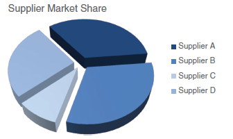
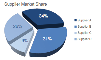
As we mentioned earlier, pie charts rely on the audience’s ability to decipher area as a measure. Humans are very bad at doing this. The following example will help illustrate this point (Knaflic (2015)). Ask yourself which supplier has the largest market share in the graph below.
 |
|---|
| Image Credits - Cole Knaflic (Knaflic (2015)) |
The consensus answer is supplier B. If you had to guess the share, what would you guess? Most people guess between 35% or 40%. In actuality, the market share is much less. Indeed, it is not even the largest piece of the pie.
 |
|---|
| Image Credits - Cole Knaflic (Knaflic (2015)) |
There are a couple of things going on here. First, the graph is tilted and made to look 3D. Because of this, the pieces that are farther away look smaller. However, even when you redraw the graph without the 3D, the challenge of determining the largest piece still remain. When segments are close in size, they cannot easily be interpreted. Why would we simply not use a bar chart?
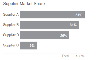 |
|---|
| Image Credits - Cole Knaflic (Knaflic (2015)) |
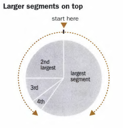
If you must use a pie chart, never put the small segments at 12 o’clock. Put the largest segment at the top (clockwise) with the next largest at the top (counter-clockwise) and filling in from there.
 |
|---|
| Image Credits - Donna Wong (Wong (2010)) |
Never use more than five slices. If your data has more than five pieces, graph the first four and then have a category labeled “other” (and place this at the end no matter the size). Avoid distracting colours and special effects like pulling slices out. If you want to highlight a particular slice, shade it a different colour.
A bar is almost always better than a pie. This is especially true when you have categorical data that is ranked. If you have data that is categorized as “very poor”, “poor”, “neutral”, “good”, “very good”, then it is more natural to put these on a line with the most negative on the left and the most positive on the right.
5.11.2 Donut Chart
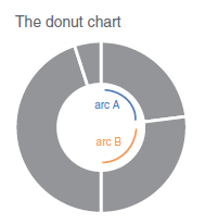
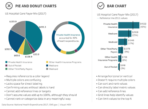
Where pie charts ask the reader to evaluate areas, donut charts ask the reader to evaluate arc lengths.
 |
|---|
| Image Credits - Cole Knaflic (Knaflic (2015)) |
Again, if you must use a donut chart, remember all of the rules for pie charts. Also, consider including the total for the donut in the centre (it’s empty for a reason after all). Finally, I will encourage you not to use a pie or donut chart but rather a bar chart.
 |
|---|
| Image Credits - Lindsay Betzendahl (Rowell, Betzendahl, and Brown (2020)) |
5.11.3 3D Charts
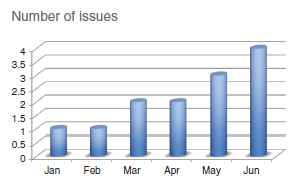
Don’t use 3D charts. Just don’t. And certainly not for a single dimension (things get weird if you are graphing three dimensions in 3D, but can get done). 3D graphs add unnecessary chart elements that distract from the intended message. For a bar graph, for example, it is difficult to know if your software is actually graphing the front or back of the graph to the height.
For example, January and February are both set to the same height. It is not necessarily that obvious by looking at the graph? Would it surprise you to know that each of the bars were set to a whole number height?
 |
|---|
| Image Credits - Cole Knaflic (Knaflic (2015)) |
There are tonnes of issues with 3D - avoid it always.
5.11.4 Secondary Axis
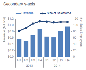
A secondary axis can be useful to show a relationship between two items with different scales. However, they should be generally avoided. In the graph below, you can see that there was an increase in the salesforce that coincided with an increase in revenue in Q4. The revenue generated by the company dipped in Q1 and Q2 despite a sustained salesforce through 2014.
 |
|---|
| Image Credits - Cole Knaflic (Knaflic (2015)) |
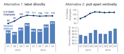
Rather than a secondary axis, here are two alternatives. Both of these give the same information, but avoid the secondary axis.
 |
|---|
| Image Credits - Cole Knaflic (Knaflic (2015)) |
